

.webp)
When we talk about product design, the conversation usually centers on functionality: what the product does, how it solves a problem, what flows it optimizes. Aesthetics are often pushed to the background, as if they were a decorative layer applied at the end of the process.
That view underestimates the role of visual design in creating a product: aesthetics aren't just a superficial phase, they're the first conversation our product has with the user, often defining whether that conversation continues or not.
This article aims to reclaim the importance of aesthetics in product design processes, reviewing some fundamentals that help us convey care and harmony in the interfaces we design.
Let's start with three reasons why aesthetics are an essential part of product design:
1. Our first reaction to a visual piece is emotional
Before a user clicks, interacts, or even reads a website, they've already formed a preliminary opinion about it.
This reaction is emotional, happens within 50 milliseconds of perceiving the design, and has the power to make a user stay and dig deeper, or leave our site without looking back.
Don Norman wrote a book, "Emotional Design," where he describes three levels of visual processing:
Visceral: This is the level described above, happening instantly when we see a design.
Behavioral: The user unconsciously evaluates how comfortable and easy to use the design is.
Reflective: After experiencing the design, the user evaluates the functioning and benefits of the site (the subsequent evaluation).
The visceral level — that first impression — rests entirely in the hands of visual design. Color, typography, proportion, and spacing all appeal to our users' visceral reaction, and are therefore essential to the success of our design.
2. We perceive attractive designs as more usable
Also known as the Aesthetic-Usability Effect.
In 1995, Masaaki Kurosu and Kaori Kashimura found that users perceive more attractive interfaces as easier to use, even when the functionality is identical.
This effect not only demonstrates users' predisposition to see the platform as more usable, but has also been shown to make them more tolerant of errors, more patient with loading times, and more likely to return.
Aesthetics build trust before the product has proven anything.
3. Designs that follow design principles help guide the user through their experience
When we respect design principles, our composition features clear hierarchies, contrast, and balanced distances. Achieving good visual balance helps the user to quickly identify sections and actions on the screen without spending extra cognitive energy interpreting the information presented.
This contributes to making them feel more secure and comfortable with the experience.
Every visual decision is, at the same time, a UX decision.
Visual design is the discipline responsible for striking the right balance between surprise and familiarity in a product.
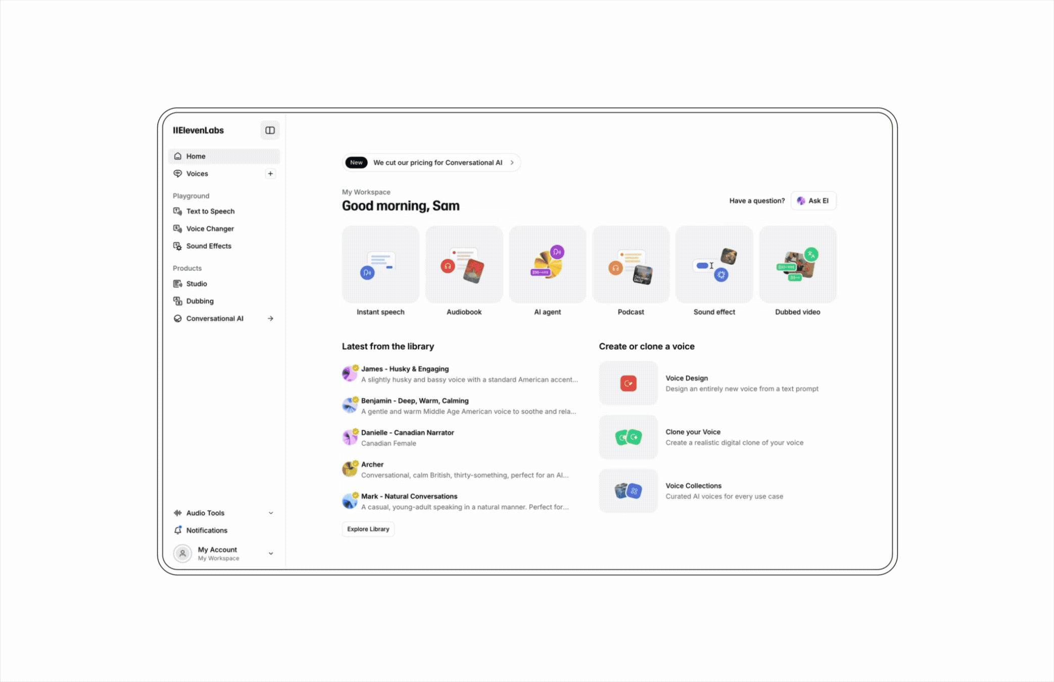
Familiar visual patterns — like where the menu is placed, what a primary button looks like, what the color red means — reduce cognitive friction.
At the same time, we tend to remember things that stand out from the ordinary more. We remember the designs that surprise us, for better or worse.
Our challenge as designers is to find the sweet spot between familiarity and surprise, creating experiences that are easy to use and safe, but memorable.
Where to begin?
As designers, we've learned to respect a series of foundational rules that guide our aesthetic decisions. Even though we know them, we don't always keep them top of mind.
Revisiting these three principles will help us be more conscious of them when designing:
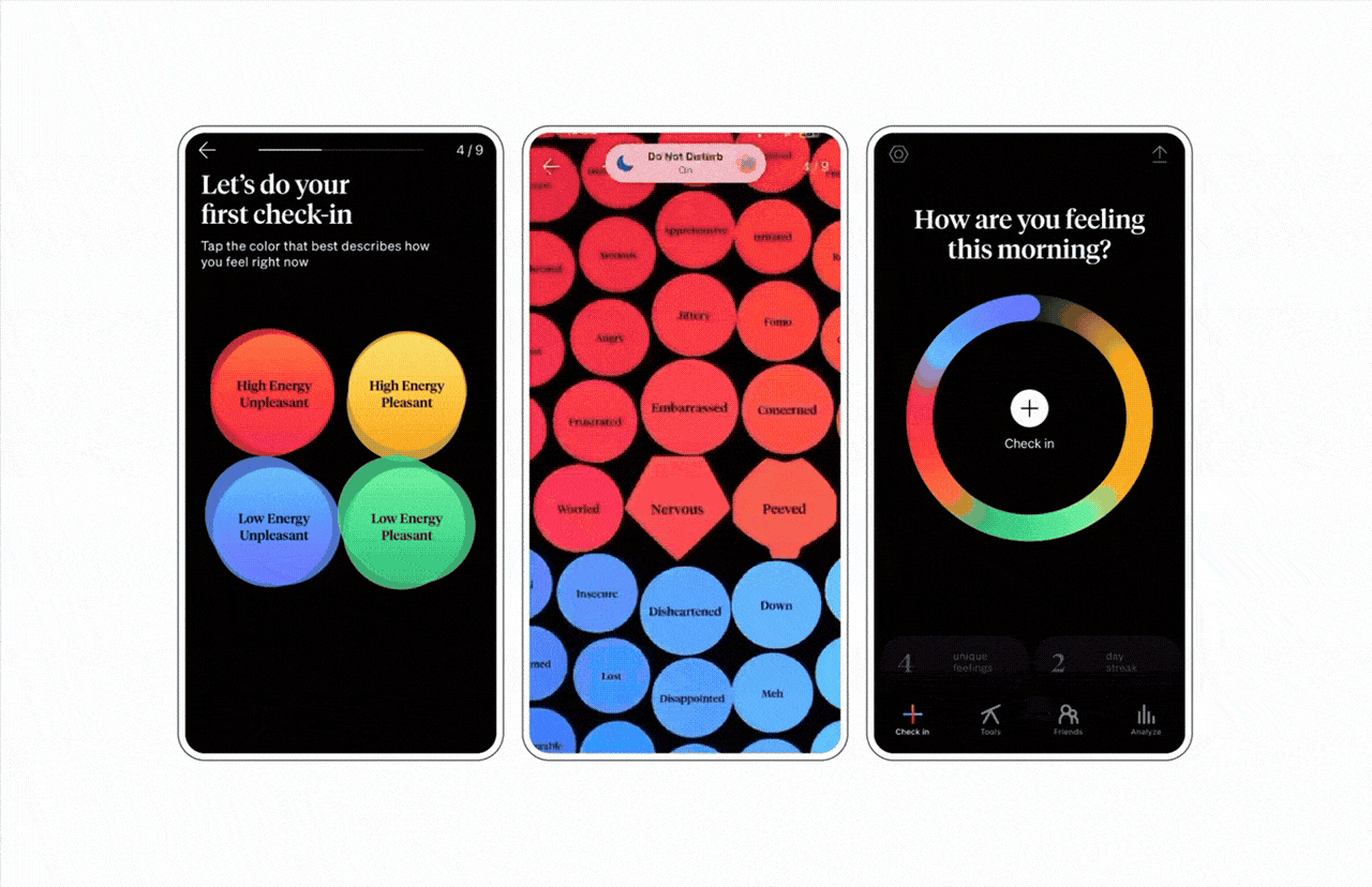
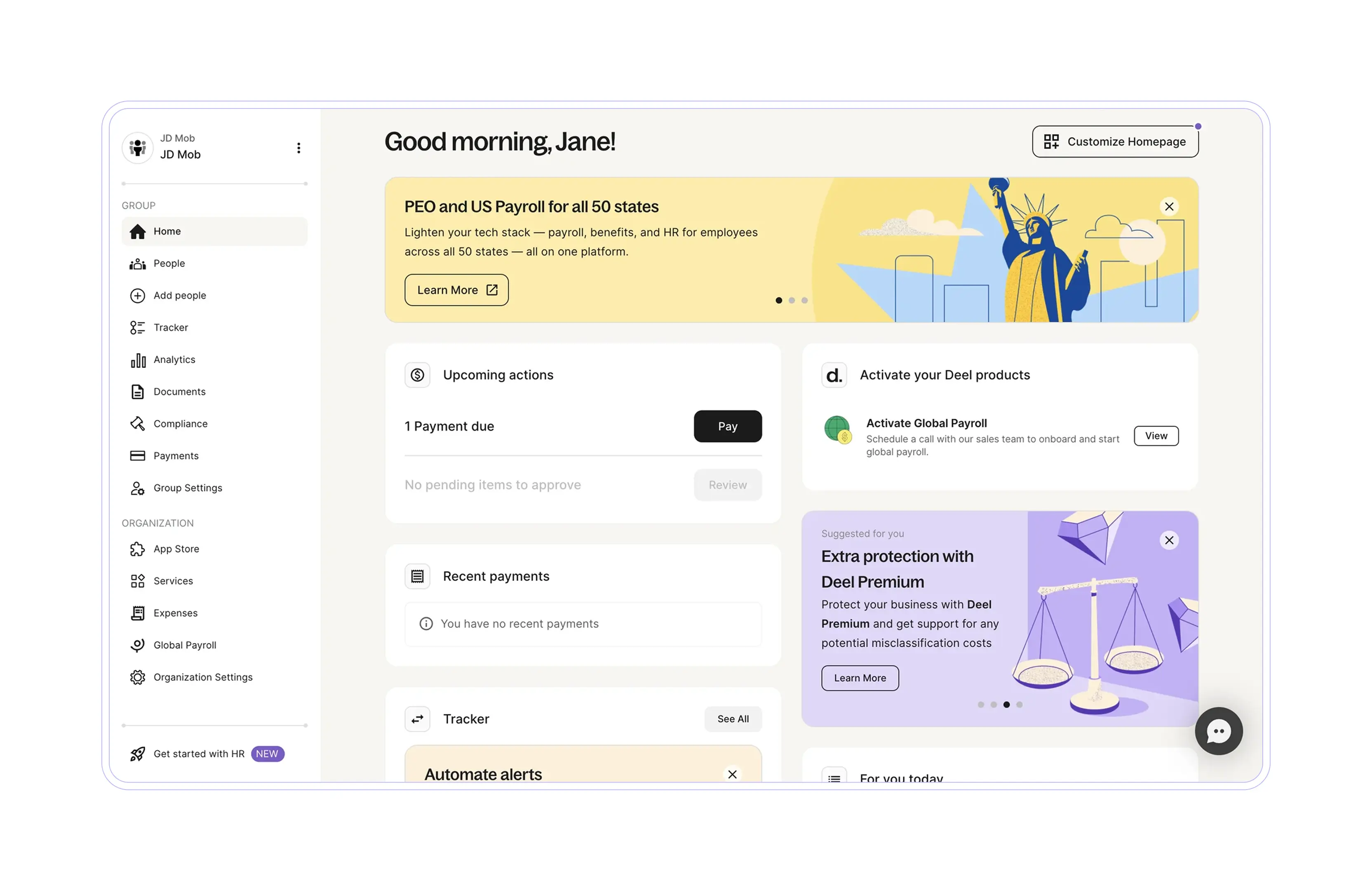
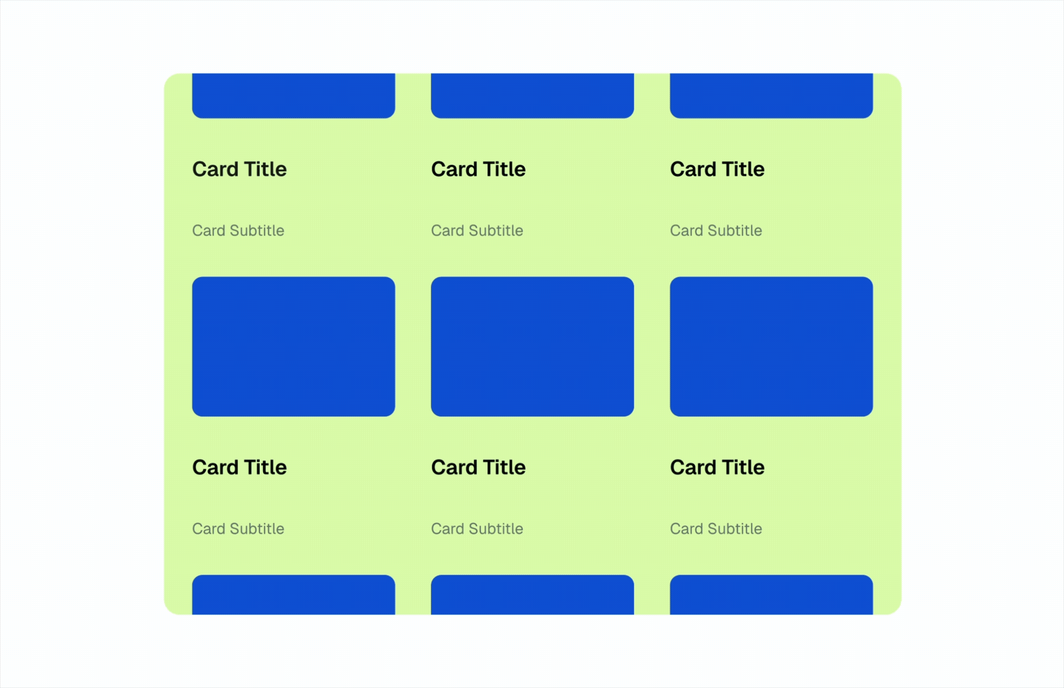
1. Visual hierarchy
Not everything can have the same importance. Visual hierarchy helps the eye know where to start and where to go next. It's built through scale, color, contrast, alignment, and proximity.
Three key rules:
- If everything is different, nothing is: Creating too many levels of hierarchy produces noise and confusion, while limiting hierarchies to a few levels helps achieve the necessary impact while maintaining the harmony of an interface.
- Clear alignments and spacing create visual harmony: When alignments are clear and negative space is well used, the eye finds greater ease with a clear guide on where to look.
- Consistency is your best ally: On sites and platforms with many screens, consistent hierarchies help users understand where they stand and identify cues even before reading.
2. Balance
The balance of the screen can affect the personality and intention you want to give a piece.
To create good balance in our products, we need to pay attention to several resources, such as the distribution of elements on screen, their weight, and how we leverage negative space.
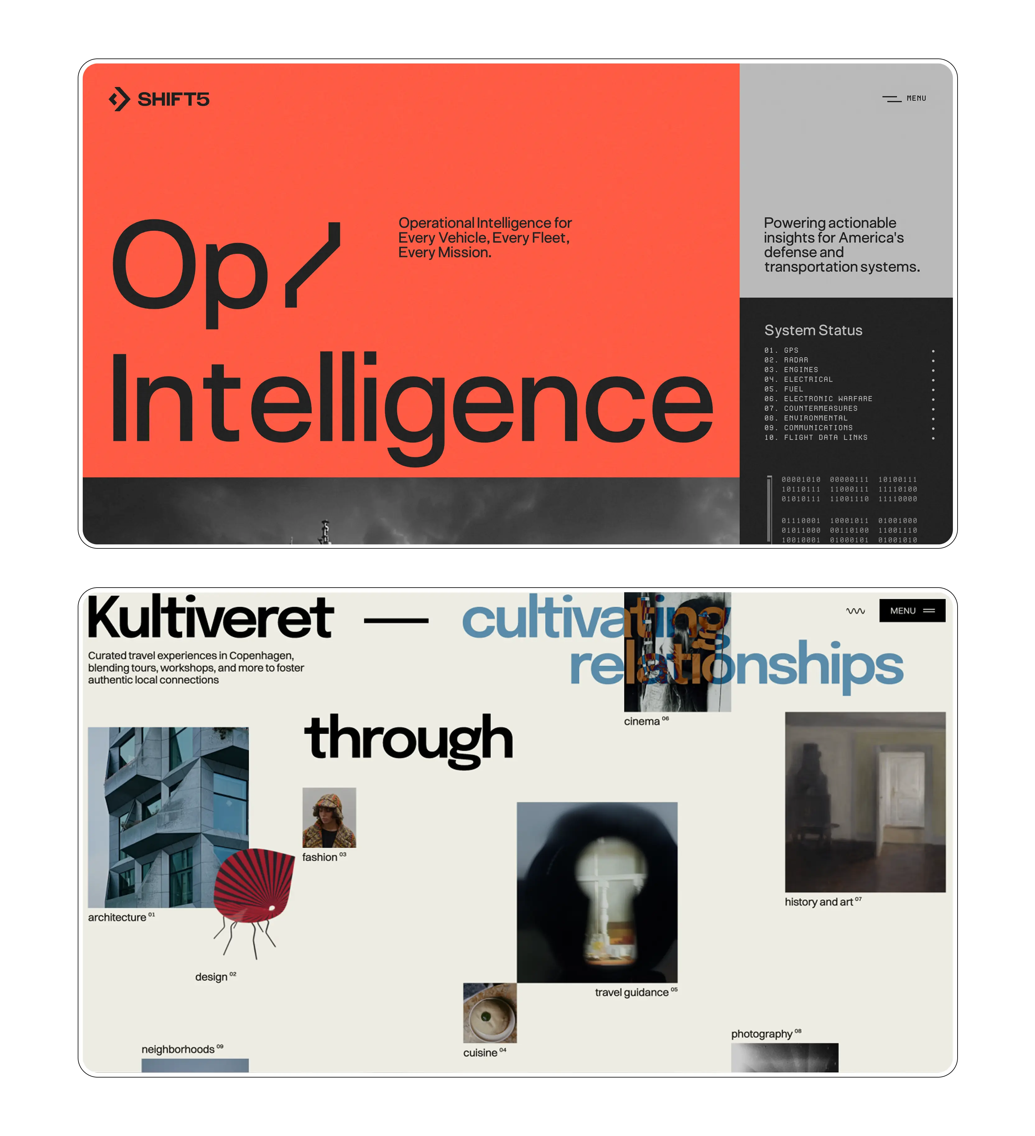
Let's look at examples of visual balance in two different types of layouts: symmetrical and asymmetrical.
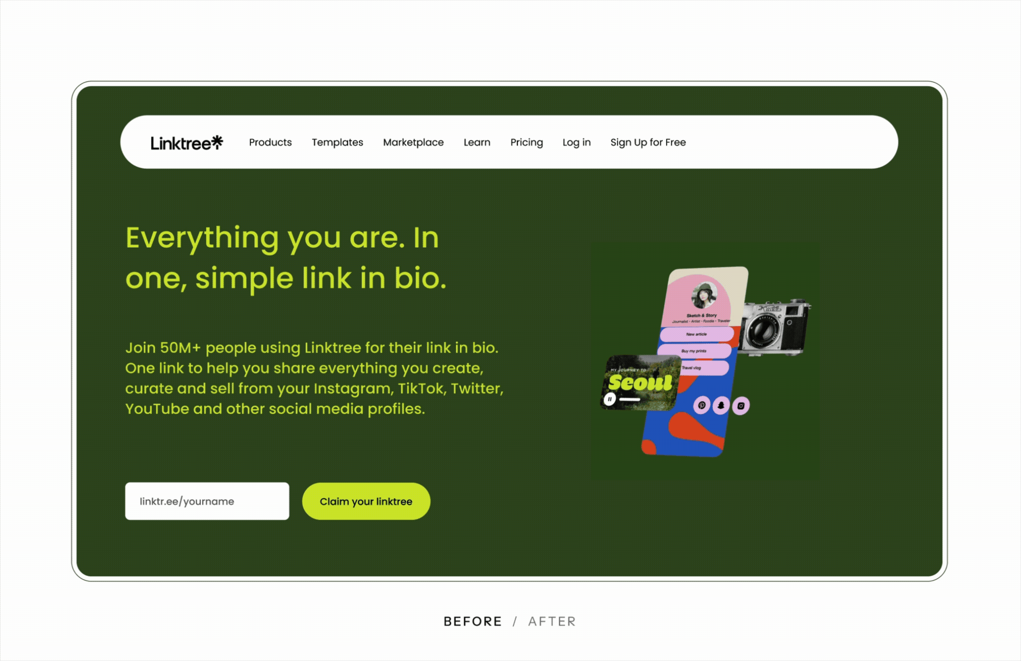
Symmetry
We talk about symmetry when elements are distributed equally around a central axis. The number of elements and the space they occupy will be the same on the left and right sides of the screen, or in the upper and lower halves.
Asymmetry
Symmetry isn't the only way to create visual balance. To achieve balance in asymmetrical layouts, the visual weight of elements needs to be distributed so the eye doesn't tire, and so there isn't an overload of weight on one side. A large element can be balanced by several small ones. A saturated color can be balanced with white space.
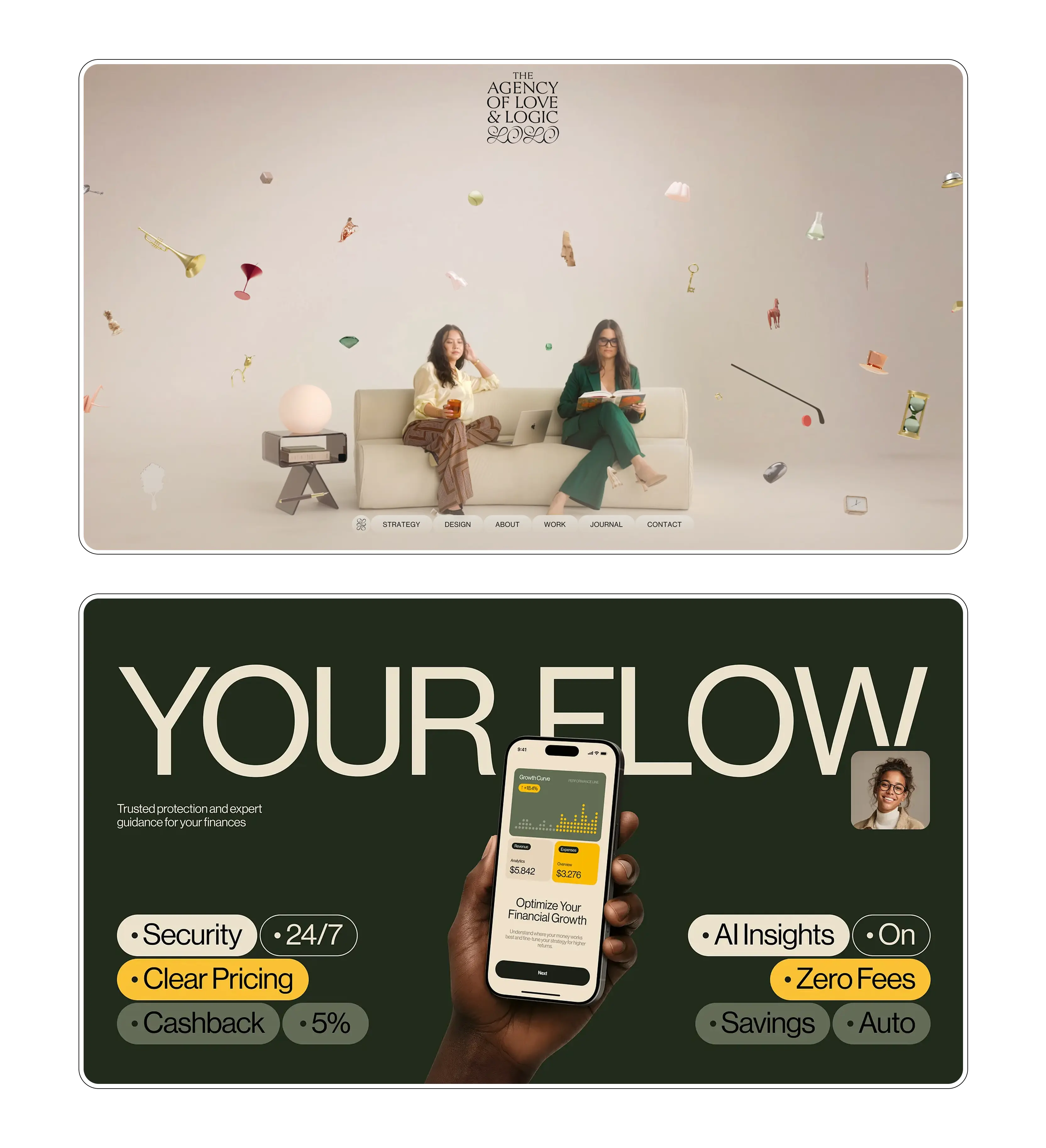
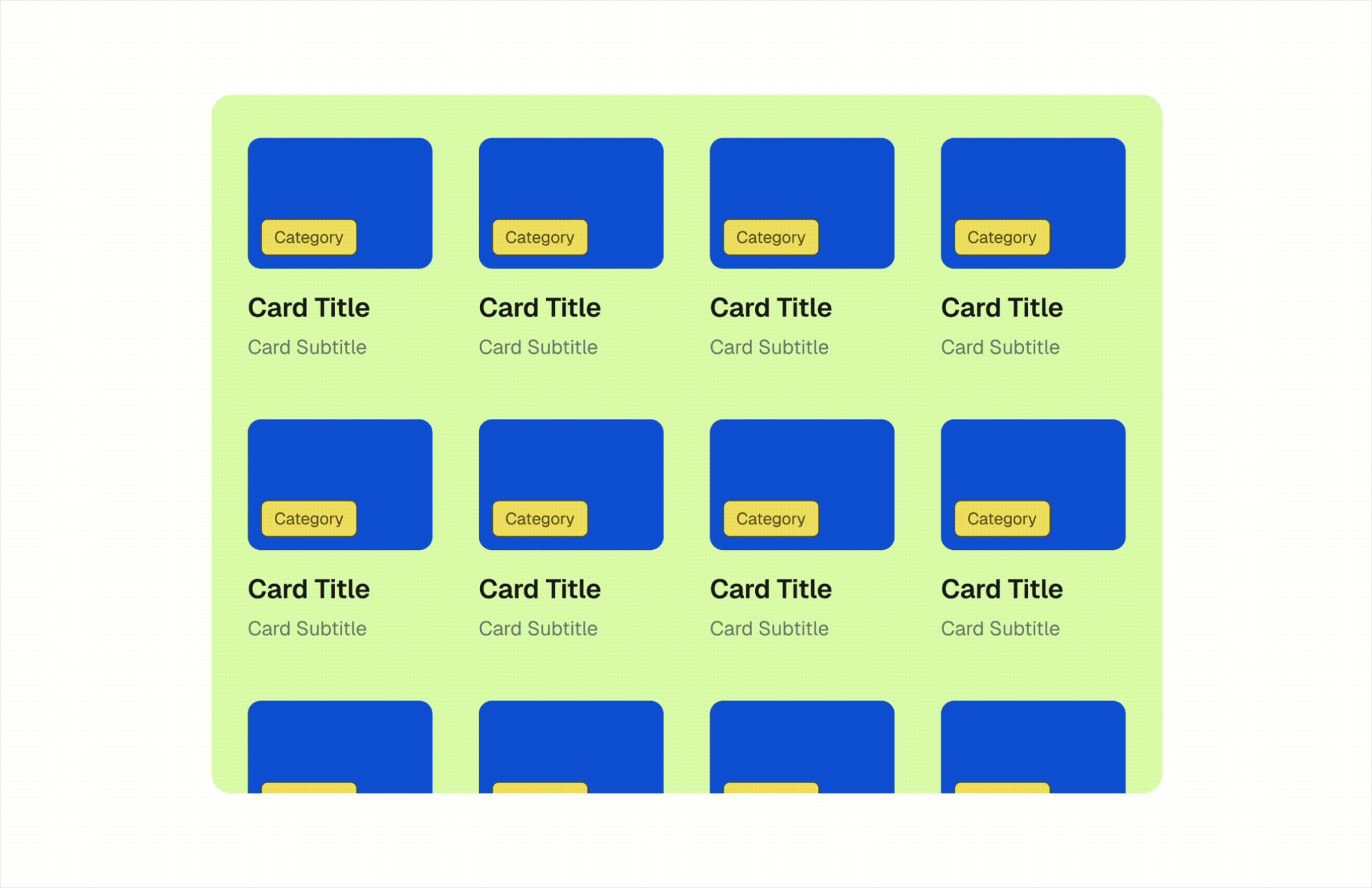
3. Gestalt principles
The brain doesn't see isolated elements, it sees patterns and relationships. Gestalt principles describe how we visually group information, and while there are many, in this article we'll revisit three essential ones:
Proximity
Elements that are close together tend to be interpreted as part of the same group. While designing interfaces, it's important to keep this principle in mind when we want elements to feel grouped (e.g., several parts of a single component), or conversely, when we want them to be perceived as separate (e.g., adding more space between two independent sections).
Similarity
Elements similar in shape, color, size, or style are perceived as part of the same set even when they aren't close to each other. Similarity can be used in interface design to categorize elements so users associate them with the same properties or functionalities.
Prägnanz
Our brain tends to organize complex information in the simplest and most stable form possible. Our role as interface designers is to arrange information in a way that feels comfortable for the user. We aim to reduce cognitive load and noise, so users interpret logically organized sections rather than many independent elements.
Summary
Aesthetic isn't decoration. A well-designed product visually doesn't just look better, it works better, because it guides attention, builds trust, and reduces cognitive friction.
Visual design shouldn't be an add-on at the end of the process. It's a decision that impacts every interaction, from the first impression to the last action.


